
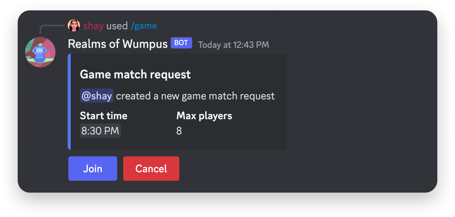
The component types#
| Component | What the user does | Typical use |
|---|---|---|
| Button | Clicks it | Confirm, cancel, paginate, open a link |
| String select | Picks from options you defined | Choose a category, a role, a setting |
| Auto-populated select | Picks from Discord resources | Choose a user, role, channel, or a mix |
Auto-populated select menus are filled by Discord with contextual resources from the server, so your app does not build or refresh those option lists.
Buttons carry a style, a label, and optionally an emoji. Each interactive component carries a custom_id you define, which comes back with the interaction and tells your app which component was used.
Handling the click#
Your app has three seconds to respond, the same as any interaction. Which callback type you pick decides what the user sees:
| Goal | Callback type |
|---|---|
| Edit the message the component is on | UPDATE_MESSAGE (7) |
| Acknowledge now, edit the message later, no loading state | DEFERRED_UPDATE_MESSAGE (6) |
| Post a new message in the channel | CHANNEL_MESSAGE_WITH_SOURCE (4) |
| Open a form | MODAL (9) |
Editing in place suits state that lives in the message, such as a page counter or a toggled setting. Posting a new message suits per-user results that should not overwrite what everyone else sees.
{
  "type": 7,
  "data": { "content": "Page 2 of 5" }
}
Sending components#
Messages that carry components use the IS_COMPONENTS_V2 flag (1<<15). That flag turns off traditional content and embeds, so the whole message body is expressed as components. See the components overview.
Next steps#
- Modals — collect typed input instead of a click
- Receiving and responding — the full callback type table
- Application commands — the commands that send these messages